Soft-boiled or hard? How would you like your egg?
aa
\
j
w
6
Å
Striber
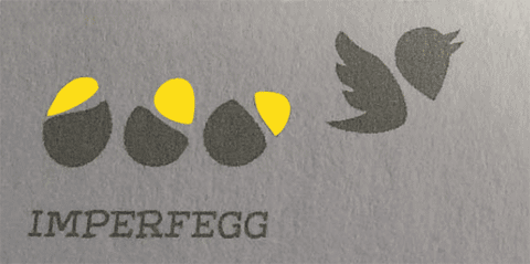
Imperfegg Font – from thin to fat
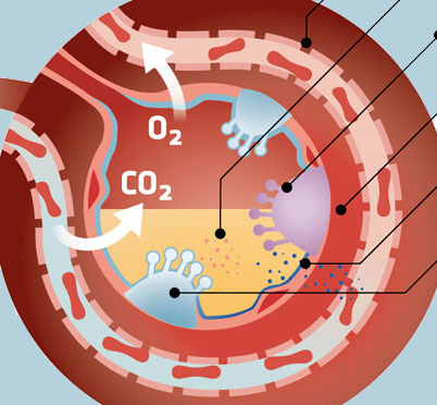
Poster: Coronavirus – fra smitte til sygdom
Logo: Asta – Den Musiske Scene
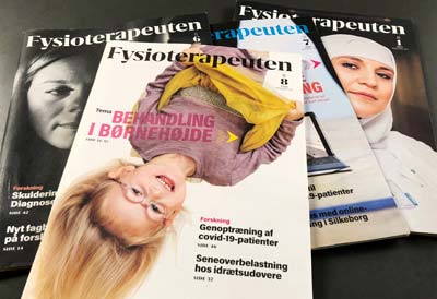
Grafisk design: Fysioterapeuten
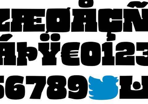
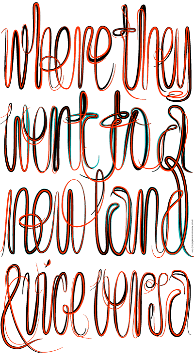
Neverendingargument Font
Web Design: Københavns Billedskærer Værksted
Illustrationer
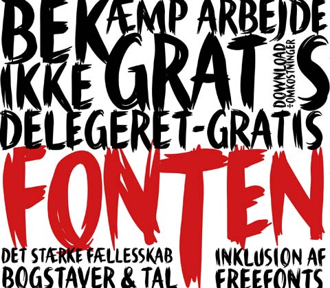
Delgeret Gratis Font
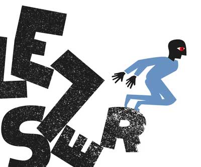
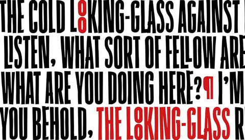
Illustration: Magazine Headings
Imperfegg.dk Web site
Lettering doodle
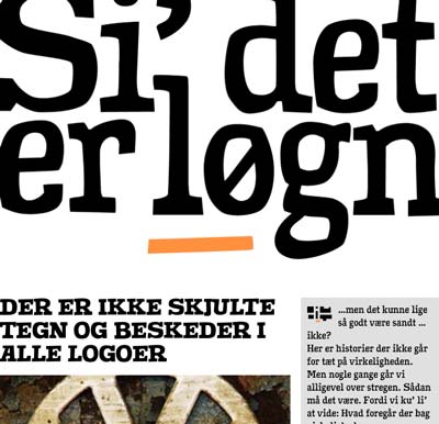
Si’ det er løgn web site
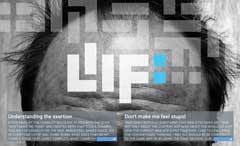
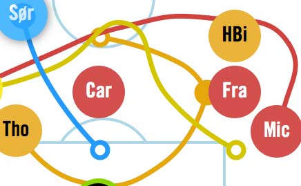
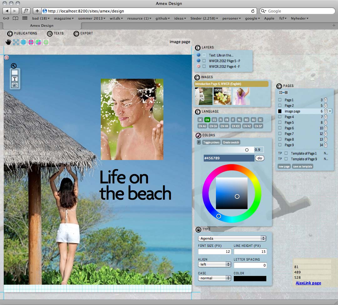
Liif: Digital magazine publishing system
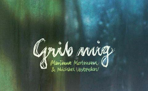
Cover design til Marianne Mortensen & Michael Vesterskov: Grib mig.
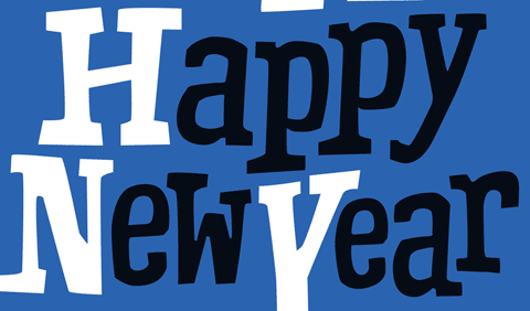
Cover til It’s A Happy New Year
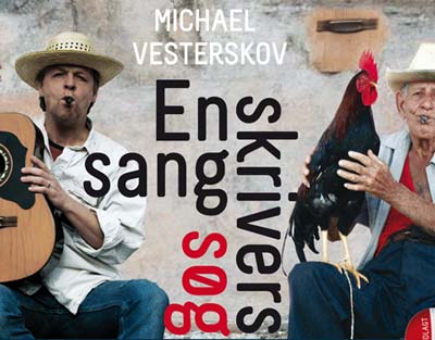
En sangskrivers søgen efter det dybe smil
Web app: Perfekte æg
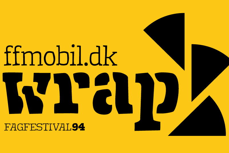
Wrapper til konference mobil site
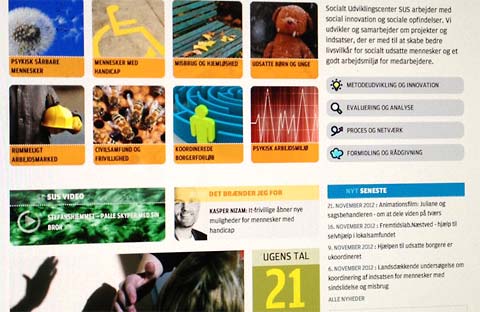
Web site til SUS Socialt Udviklingscenter
Byggefagenes Samvirke Web site og cms
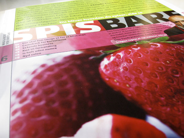
Magasinet Spis Bare=> Mad & mere for fagfolk
Opstilling og strategi app til FC Frederiksberg
Online layout application
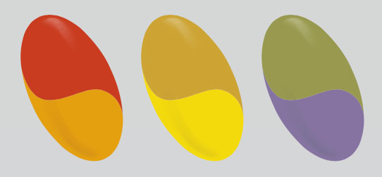
Custom built tool to select RAL colorset
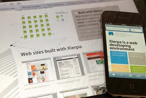
Xierpa præsentation web site
Nummerering til OK identitet
Logo til Personalekonsulentfirmaet HR7

Logo forslag til Vikasku
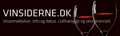
Søgemaskine til vinsiderne.dk
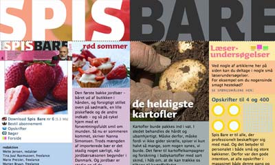
Spis Bare Web site
This web site is build in a portofolio template, that also will be available as wordpress template.
If you are interested in that template or similar functionality, give me a call.